Chosen theme: Balancing Visuals and Words in Design Projects. Welcome to a space where imagery, typography, and language collaborate instead of compete. We’ll explore practical methods, inspiring stories, and smart rituals that bring clarity and emotion together. Join the conversation, share your challenges, and subscribe for weekly ideas that sharpen both your eye and your voice.
People make snap judgments in seconds, so visuals must set the mood while words define the promise. Reduce friction, clarify the single idea, and avoid competing signals. Comment with a recent screen where your first read felt effortless.
Decide who leads: if the image carries context, keep the headline crisp and directive; if the headline is conceptual, choose a quiet image. Prototype both versions, time first comprehension, and invite teammates to vote with short rationales.
Crafting a Visual–Verbal Hierarchy
Type scale sets rhythm; color signals priority; white space lets messages breathe. Use contrast to anchor meaning, not decoration. Pair subdued palettes with stronger verbs, or bold palettes with restrained copy. Screenshot your favorite pairing and tell us why it works.
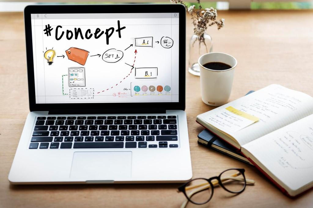
Start with real words, even if imperfect. Wireframe with blocks of meaning, not lorem ipsum. Designers shape the eye path while writers trim and tune verbs. Try a grayscale pass together and share your notes from the first review.
Write alt text to convey intent, not just objects. Explain what the image contributes beyond the headline, and avoid repeating on-screen copy. Keep it concise and specific. Post an example of alt text you revised and why it improved clarity.
Color Contrast and Legibility
Ensure sufficient contrast, particularly where text overlays imagery. Prefer solid backgrounds for critical copy. Use readable sizes and generous line spacing. If you improved a page’s contrast recently, share a quick before–after insight in the comments.
Motion, Audio, and Reading Modes
Provide reduced-motion options, captions, and transcripts. Offer dark and light modes that keep hierarchy intact. Ensure interactive elements have clear labels. Tell us which setting your audience prefers and how you discovered that preference.
Set Hypotheses and Success Metrics
Write a specific claim before you design: who leads, what changes, and why it matters. Pick a measurable outcome such as time to comprehension or task completion. Share one hypothesis you’re testing this month and your primary metric.
A/B and Preference Tests That Teach
Test a strong contrast: word-led versus image-led. Ask users to explain first impressions aloud. Track what they remember one minute later. Post the most surprising finding you’ve seen from a recent preference test and how it changed your direction.
Qualitative Stories and Team Reflection
Collect field notes, screenshots, and user quotes. Hold a short retro to connect results to process: what to keep, change, or stop. Share one reflection that will guide your next sprint toward stronger visual–verbal alignment.