Today’s chosen theme: “Maximizing Impact: Words that Sell Design”. Welcome, creators and communicators—this is your space to turn beautiful interfaces into persuasive narratives that win hearts, budgets, and measurable results. Stick around, share your experiments, and subscribe for weekly prompts.
Translate a feature into a user benefit: ‘Rounded corners’ becomes ‘Fewer visual snags, faster scanning.’ When stakeholders hear outcomes, they lean in. Try rewriting three portfolio captions into promises, and ask readers to vote in comments and subscribe for weekly rewrites.
The 5-Second Rule
Above the fold, five seconds decide bounce or belief. Pair a crisp promise with a proof point: metric, award, or recognizable client. Share your best five-second headline below; we’ll spotlight favorites next issue and discuss what made them instantly credible.
A/B Stories from the Studio
We tested ‘Design that delights’ versus ‘Cut checkout time by 32%.’ The second won by miles. Emotion opens the door; specificity seals the deal. Have a headline duel? Send it in for teardown, and subscribe to learn which patterns consistently outperform.
Microcopy That Moves: Buttons, Labels, and Helper Text
Start buttons with clear, low-friction verbs: ‘See plan’, ‘Start free trial’, ‘Compare options’. Avoid vague ‘Submit’. Verbs guide momentum and respect autonomy. Drop your top three CTA experiments in the comments; we’ll compile a community playbook for subscribers.
Map tone on axes like formal–casual, playful–serious, and bold–cautious. Align with business goals and audience. Publish the grid for your team. Want our template? Subscribe and comment “tone” to get the link and a quick-start calibration exercise.
Plain language improves accessibility, reading speed, and trust. Replace idioms, avoid ableist phrases, and use descriptive alt text. Test with screen readers and diverse users. Share an inclusive rewrite you love so others can learn, borrow, and credit your example.
Own the issue, explain next steps, and offer recovery in one line. “We saved your draft. Try again in 30 seconds.” Got a kinder error message? Post it below; we feature standout examples monthly to elevate empathy and reduce user frustration.
UX Writing Meets Visual Hierarchy
Design copy for skimmers first: promise in the headline, payoff in the subhead, proofs in bullets. Visual rhythm plus verbal rhythm wins. Share a screenshot of your most scannable section for a constructive community critique and a chance to be featured.
Short paragraphs breathe; long ones suffocate. Use sentence variety and typographic hierarchy to guide focus. If every sentence shouts, none persuades. Submit a layout before-and-after; we’ll spotlight striking transformations that pair editing with intentional spacing.
Icons become meaningful when captions clarify action. Pair each pictogram with a precise verb and outcome. Test comprehension without the label to validate clarity. Show your favorite duet, and let’s trade pattern libraries while cheering measurable improvements.
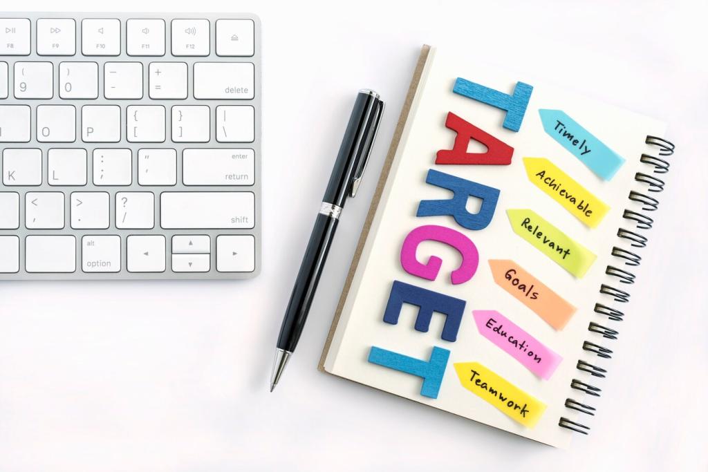
Specificity Beats Superlatives
Swap “world-class” for specifics: numbers, timelines, constraints conquered. A single, credible detail outperforms ten adjectives. Comment with one concrete proof you use, and we’ll assemble a credibility checklist for subscribers hungry for honest persuasion.
Lead with a person, back with a number. “Priya finished onboarding in eight minutes—down from twenty-one.” Stories stick, stats convince. Have a mini success story? Share it, and we’ll spotlight reader wins that show design value in real life.